

10 Colours You Shouldn’t Have in Your Home

You'll regret adding these colours at home.
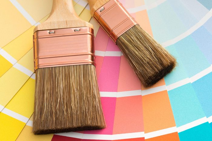
Finding the right colour
Picking out the perfect colour for different parts of your house is challenging. On top of that, certain colours can add or decrease the value of your home. Check out the following colours pros say you shouldn’t have in your home.
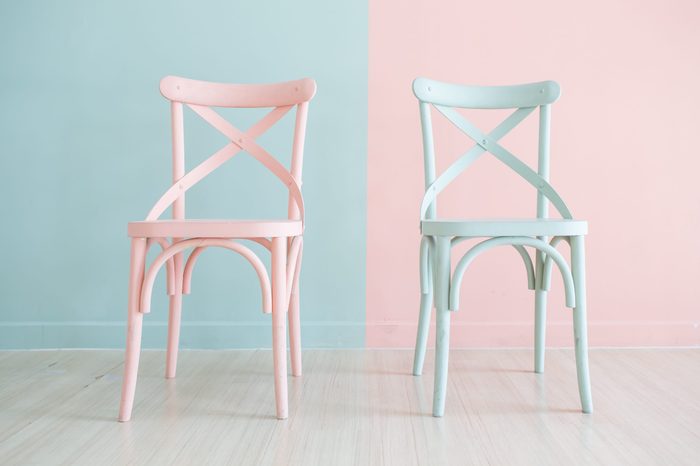
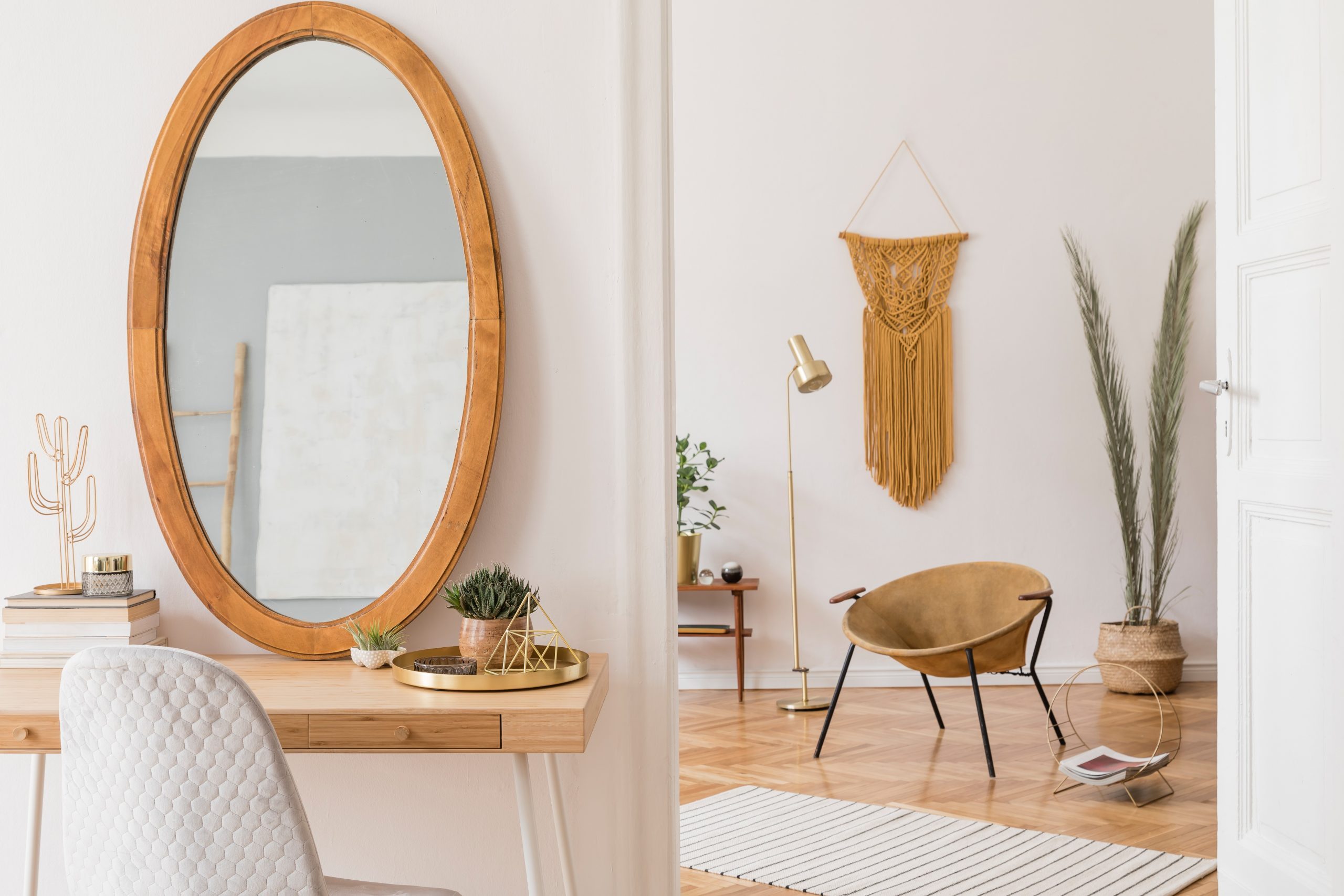
Painting in pastels
Baby blue and millennial candy pink are lovely and soothing, but they don’t translate well on the face of the home. “Curb appeal is very important, whether your home is on the market or not,” says Leneiva Head, owner of Welcome Home Realty in Tennessee. “You always want your home to feel welcoming.” And don’t forget the front door. It’s part of the all-important first impression.
Watch out for the 13 things you’re doing to your home that real estate agents wouldn’t.
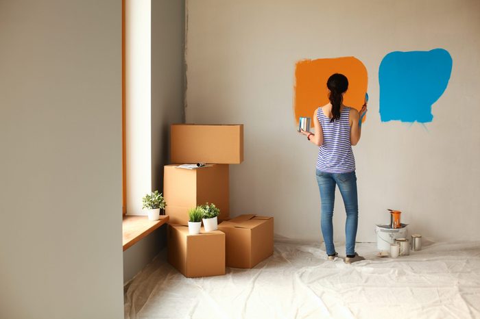
Using loud and bold colours
Hey, it’s your house, and if you want to paint your living room blood red and your kitchen pumpkin orange, go for it. But real estate agents would rather dip their paintbrushes into neutral colours. “There is a reason real estate agents and house flippers use neutral colours—they appeal to larger audiences,” says Parks. She also advises against wallpaper. There’s a slim chance a buyer will like it, and most buyers will take one look and think of the cost and labor to remove it.
Bring in good fortune with these 11 lucky things to always keep in your home.
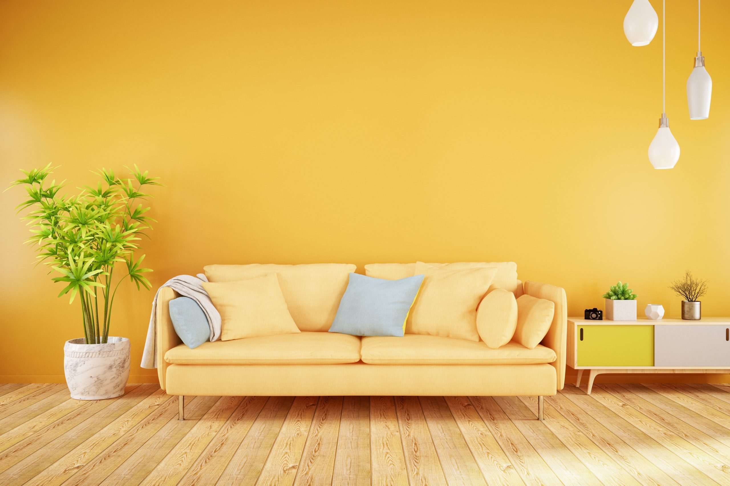
Red and yellow
In an episode of the popular home improvement show, Property Brothers: Buying and Selling, the duo—Jonathan and Drew Scott—noted that there are two colours that should never be used to paint interior walls: Red and yellow. You should stick to warmer, neutral tones such as greys and blues.
Before you start, read these 20 painting tips from professional painters.
Warm white
Any white with a warm undertone can look dingy, especially in the wrong light. Consider Benjamin Moore’s Decorator’s White or Farrow & Ball’s All White, both of which are crisp without being clinical.
Here’s how you should decorate according to your zodiac sign.
Builder’s beige
The neutrals that can help sell a home can also give off a dirty cast. Avoid yellowy or greenish beige or khaki, which don’t cast anyone in a flattering light. If you want a nice neutral, consider something like Sherwin Williams’ Agreeable Gray, which deftly toes the line between taupe and grey.
These 12 decorating tips will help sell your home fast.
Green
Again, those sneaky yellow undertones. Pale greens can sometimes feel like sickrooms, or cast a pallor upon your favorite faces. Instead of worrying about the relative minty-ness or sage-like qualities of light greens, consider cashing in on one of the latest trends, which looks flattering in both modern and historic homes: hunter green. Shy away from the browner undertones (such as Benjamin Moore’s Green Grove or Forest Hills) and opt for something like the deep, bold Chrome Green or the bluish Narragansett Green.
Don’t miss these 100 vintage home hacks that are still brilliant today.
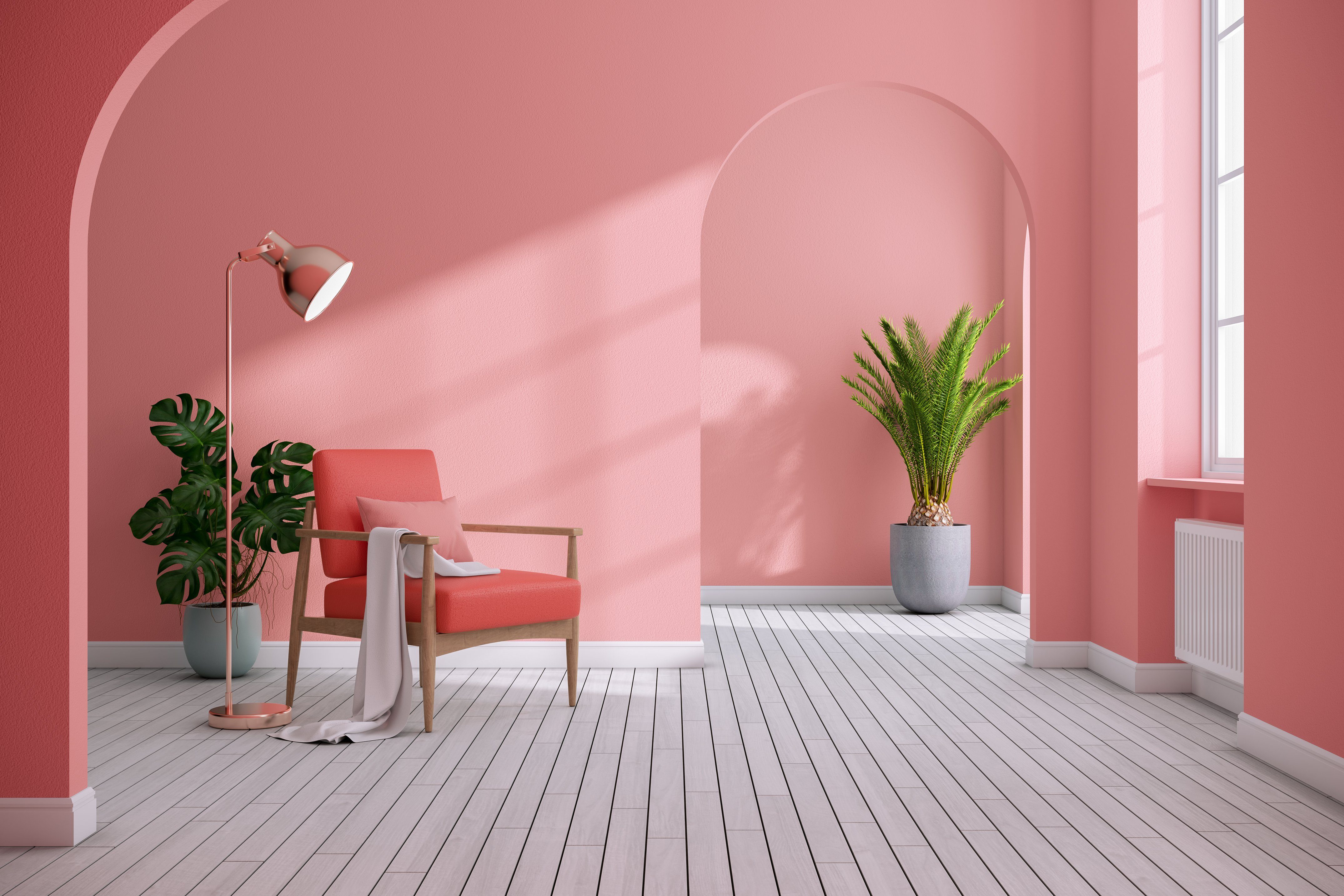
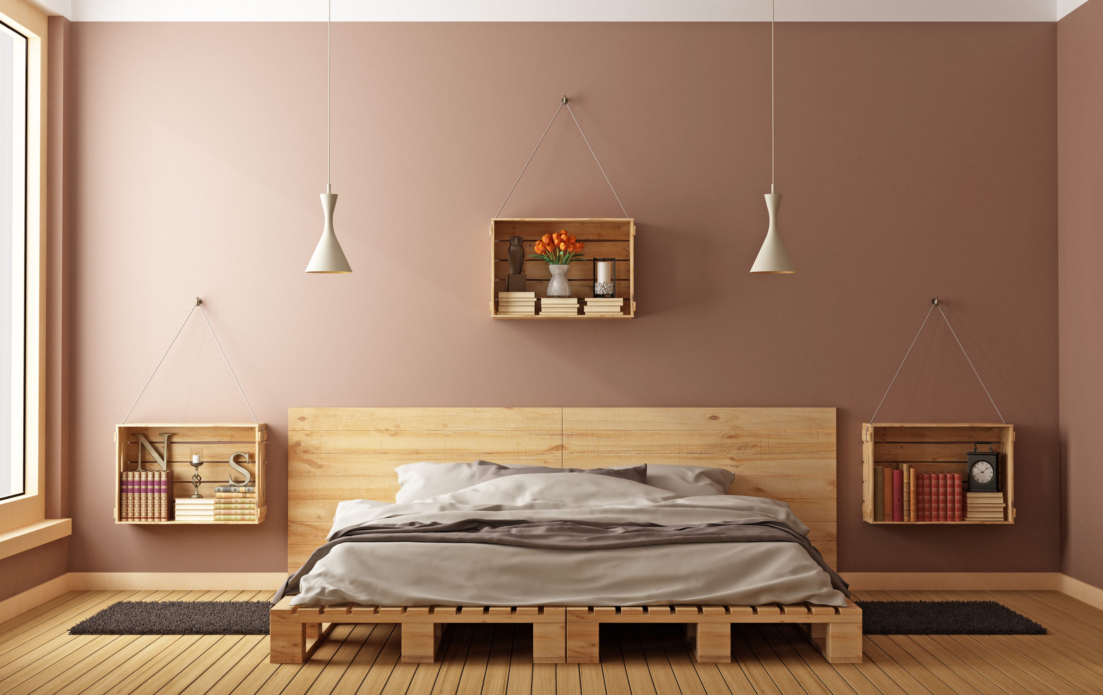
Pink
Pink can be a struggle. Too light and it feels sickly-sweet. Too muddy, and you guessed it—dirty. But the current pink trend has turned into using pink as a neutral, so choosing the right one may be in your future. Farrow & Ball’s Sulking Room Pink is sophisticated, muted and it has good depth. This is also an appropriate substitute for any terra-cotta tones you’re considering.
Discover how to decorate for the holidays, according to your zodiac.
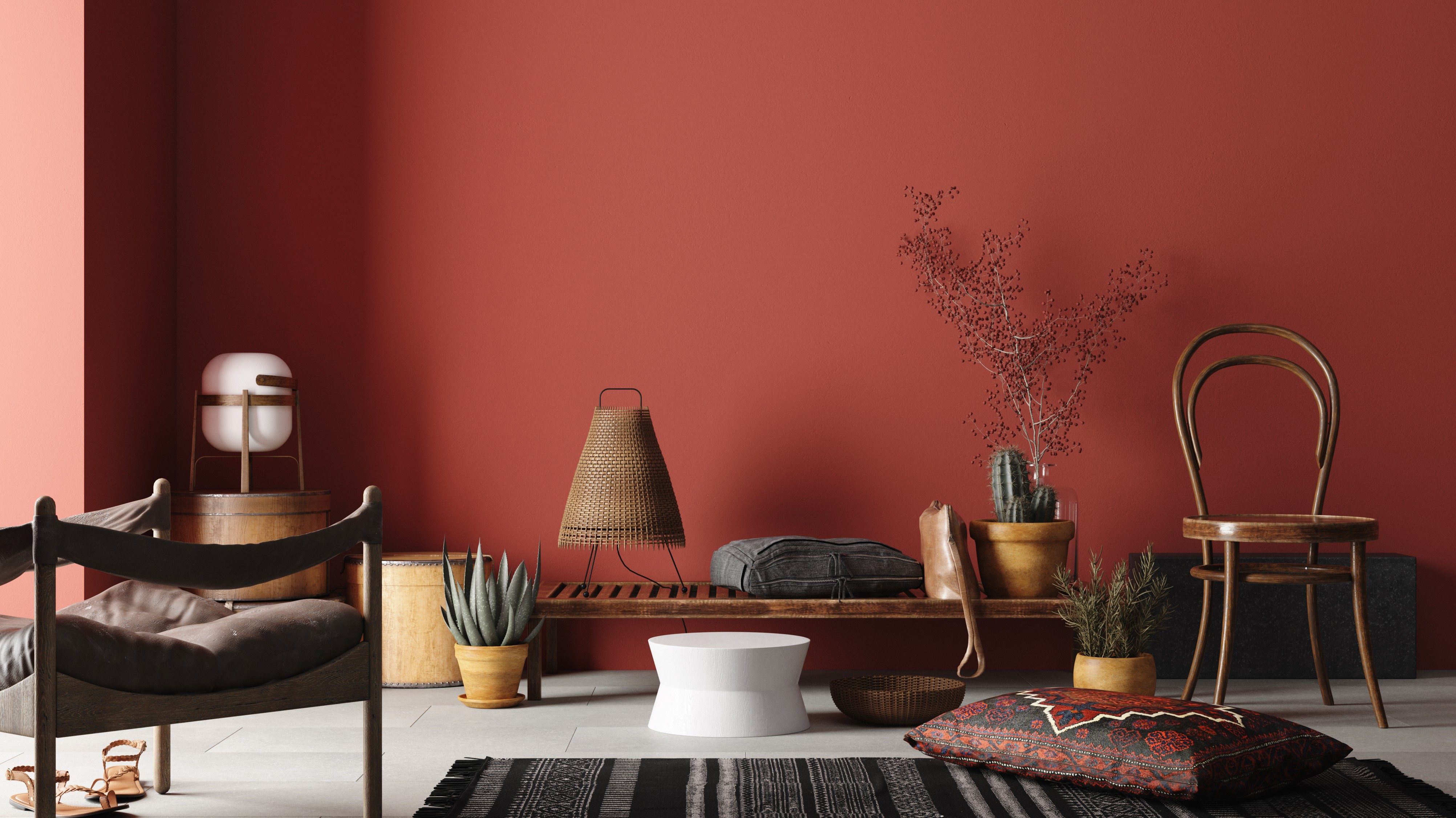
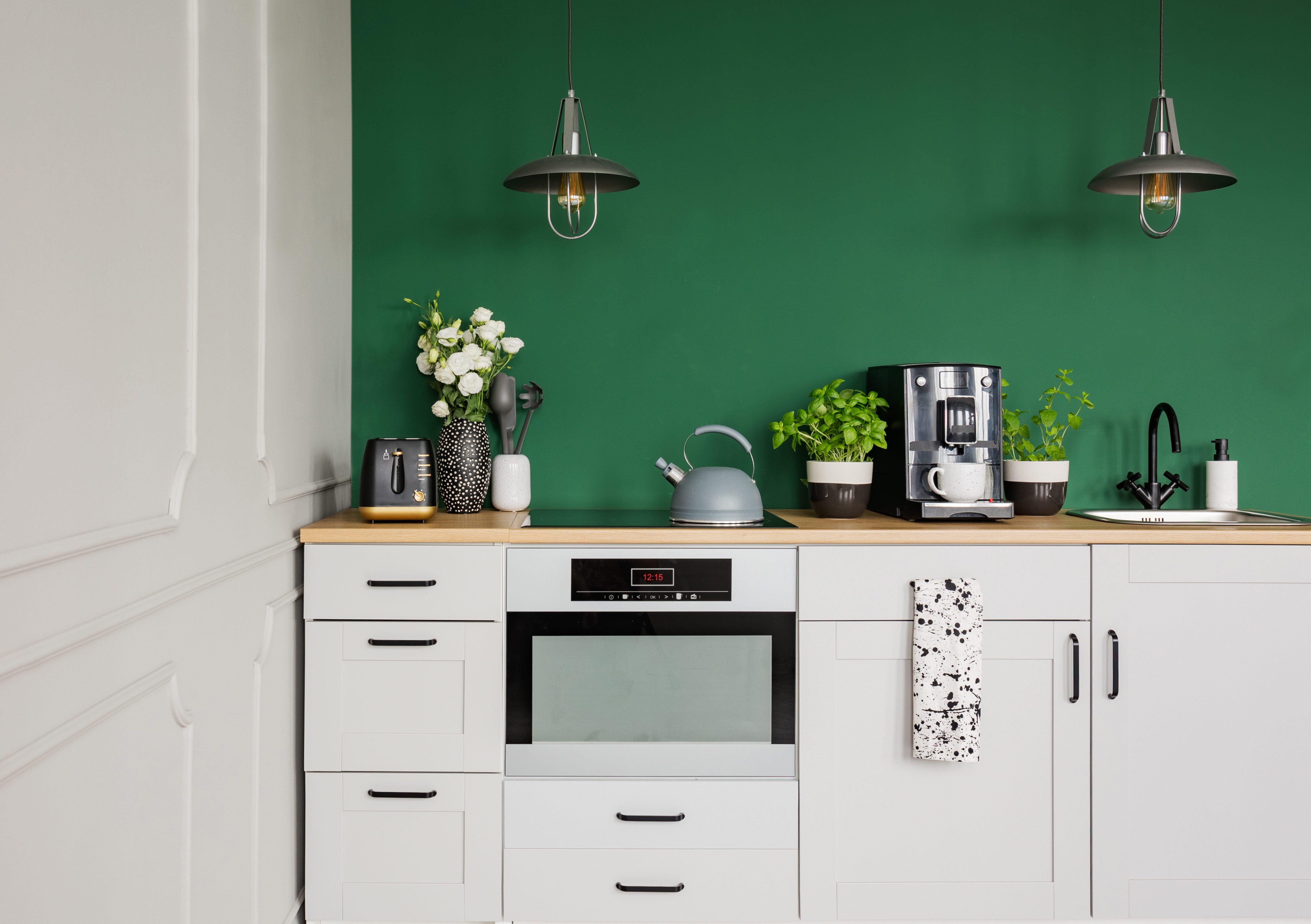
Copper red
Zillow came out with a paint analysis that took a look at the best colours to use to paint different parts of a house and found that kitchens painted brick red, terracotta or copper red sold for an average of $2,031 less than other homes. Try a white instead in the kitchen. Since most people start their days in the kitchen, white will energize the room.
Keep your home in tiptop shape with these nine things all homeowners should do once a week.
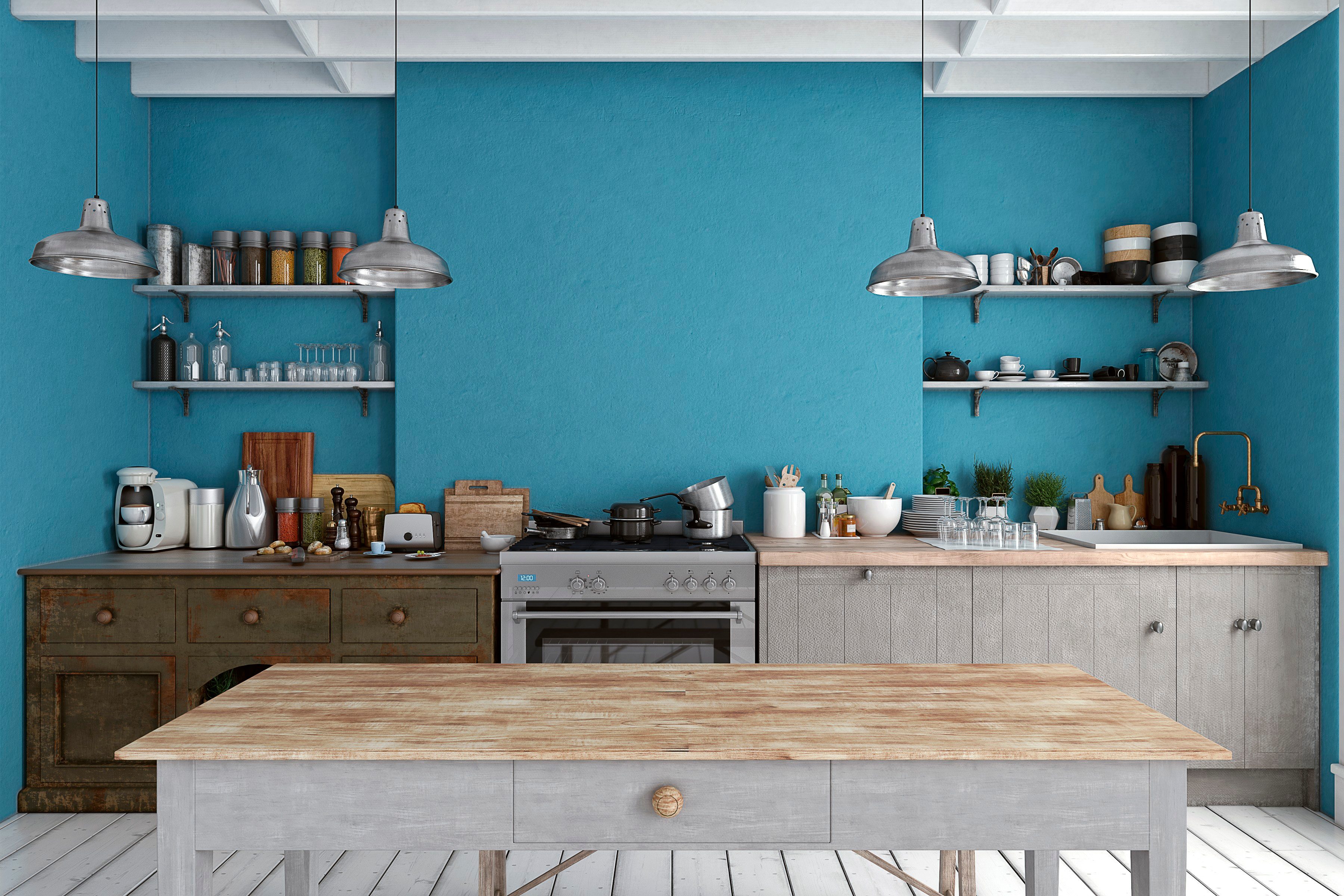
Blue
A study by Appetite found that people ate more snack foods and drank more soft drinks that were in blue packaging, so that could extend into the kitchen if you decided to use that colour.
Try these 10 interior painting tips for flawless walls.
Brown
Zillow’s analysis also found that homes that have a medium brown, taupe or stucco colour sold on average $1,970 less than homes painted other colours.
Next, here are 21 clever hacks to make your home smell amazing.