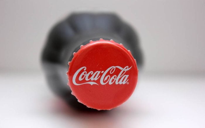
Here’s Why the Coca-Cola Logo Is Red
Updated: Feb. 12, 2023

Everyone can recognize the Coca-Cola logo, but it hasn't always looked the same as it does now.
Coca-Cola and the color red go together like peanut butter and jelly, milk and cookies, or tacos and Tuesdays. After all, we would recognize that iconic red label (or maybe even that Coca-Cola yellow cap) anywhere. But why did the company choose this shade for its logo in the first place? And once you learn more about the Coca-Cola logo, check out these secret messages in company logos you may have missed.
Why is the Coca-Cola logo red?
Some claim that the red color came from one of the company’s first advertisements, which featured Santa Claus wearing his famous red-and-white suit and holding a Coke bottle. But according to the Coca-Cola Company, its famous logo dates back to the very beginning of the brand itself.
Over 130 years ago, Coca-Cola was sold in barrels at American drug stores and pharmacies. Alcohol was distributed in the same way. But while alcohol was taxed at the time, soft drinks were not. So, the Coca-Cola Company began painting its barrels red in order to help customs and tax officials distinguish them from barrels of booze. There’s also a scientific reason why so many logos are red.
Coca-Cola logo history
The Coco-Cola logo is a trademark of its time, yet has remained fashionable through generations. Another hallmark for the branding of the drink is its placement inside a red circle. This design made for easy decoration and advertisements in restaurants and stores.
The shade and shape stuck—and the rest is history. Now, “You see a red disc icon on a storefront, and you know that you’ll be able to get delicious, ice-cold Coca-Cola there,” Ted Ryan, a Coca-Cola archivist, said. “It became a promise in a way.”
You won’t find this beverage’s famous hue in any Pantone color registries, though; it is actually a combination of three different shades of red. The Coca-Cola logo’s typography, on the other hand, is an official font. Called “Spencerian,” it has been associated with the brand since the late 1800s. But who is the person behind the iconic script? It was not the creator, but his bookkeeper Frank M Robinson, after he suggested that the two C’s would look attractive in advertising. This is just one of those random, interesting facts that may have just blown your mind.
That said, the Coca-Cola logo hasn’t always looked the same as it does today. A few years after its inception, the logo swapped the swirly font for a more gothic style. This only lasted a year. Now that you know all about the coca-cola logo, read up on another food star: the Pringles man.
Sources
- Business Insider: “There’s a reason Coca-Cola’s branding is red — and it has to do with booze”
- The Sun: “This is the real reason Coke cans are red… and it has nothing to do with Christmas“
- Coca-Cola: “Trace the 130-year Evolution of the Coca-Cola logo”


